Today I was asked to describe visually what I do. The other participants in this exercise came up with interesting depictions of what they do. The estate planner started with a tombstone, for example.
Me? I was terrified. We design such beautiful websites but since I am not the designer, I was at a loss on how to depict what we do. How can I show, with a color marker, how awesome our work is? And when I fall short, how bad will my company look (even though it was just a small group exercise with people I know and trust).
Then I paused to think about what we do. And it hit me.
My drawing, though crude, was about like this:
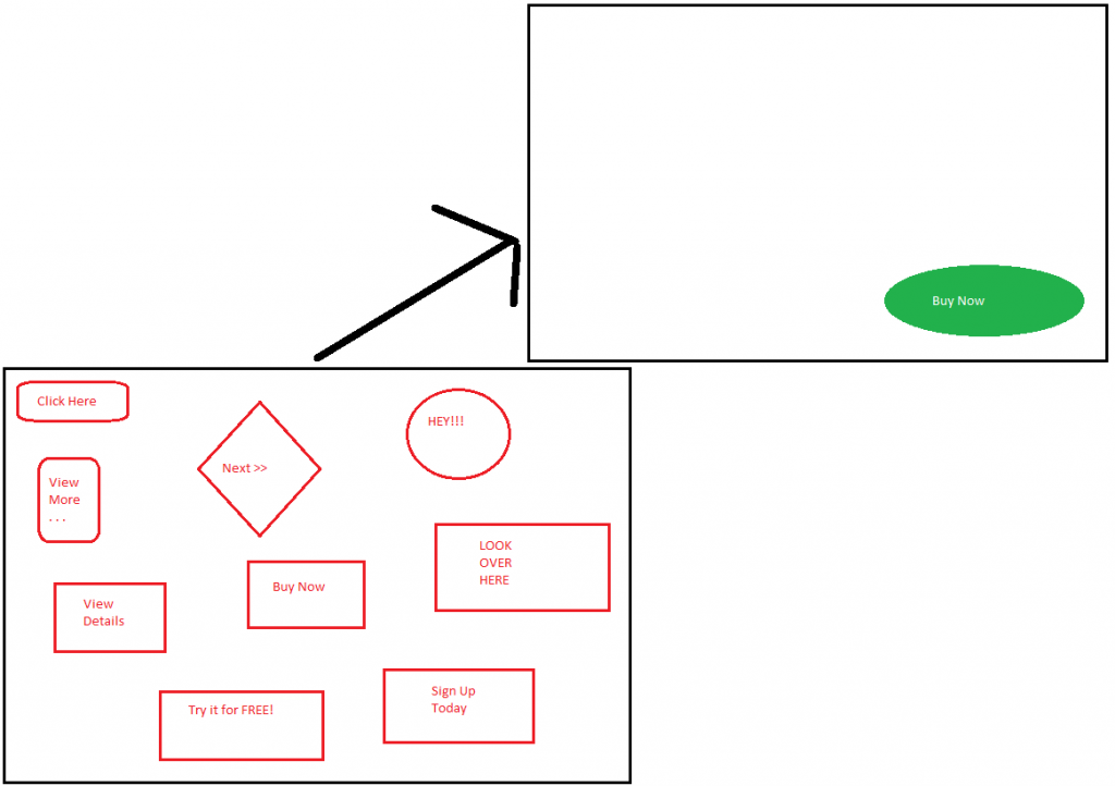
We take web sites that look like the one done in red and make them more like the one in green. Yes it is a gross oversimplification but it conveys the message.
We take web sites that have too much happening and work with the company or organization to clarify their goals. In many ways, having a good website is akin to having a good strategic plan. If your plan is to go where the wind blows today and then go in a different direction tomorrow because the wind has shifted, your business and your web site will likely be like the image on the left. Lots and lots of things are happening – many calls to action – but there are so many that it isn’t clear which one is for me.
When you have a clear goal (or two or three) instead of 9 or more, then your business can move forward better and your web site can be more effective. Think about it. If you have two or three things to do today, you can do them and you’ll know when they’re done. If you have nine or ten, you might get most of them done but will it be the important ones? Or will you do the easy ones and say to yourself “I got most of my list done!”? The same thing happens with your web site. You give lots of actions for people take and they may very well take some of them. But are they the ones that will help your business grow? Will they be the kind of lead that makes someone call you or click the buy button?
At first blush it may seem counter-intuitive but actually removing items from your web site, removing calls to action that aren’t central to its purpose, can help you get more customers. They have fewer choices so it is easier for them to take the right one.
Really it boils down to two related questions:
- What are your goals for your website?
- What do you want people to do on your website?
A good example of an answer is: I want 10 new customers a year through my website. On the site I want prospective customers to fill out an information form telling me what their pain is – what problem they are trying to solve – and submit it.
Oh, and just to be clear, there would be more on the redesigned page than one button. Although there needn’t be. Have you checked out Google’s landing page lately?