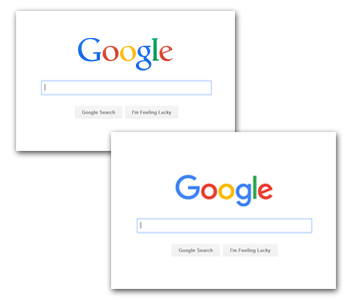
EduCyber incorporated in the summer of 1998 and Google in the fall of the same year. They’ve been following us ever since . . . ok well that may be somewhat of an over statement but when they changed their logo last year, they simply followed what we have known and been telling our customers for years. Sans serif fonts are much easier to read on the web so avoid serif fonts where possible. Their logo changes from a font with serifs to a sans serif font. Two things that happened when they did that change: 1) the image size was decreased – making it load faster and 2) it is easier to read on mobile devices.
 The moral of the story remains the same thing we’ve been saying all along: use sans serif fonts on your site. Even if your logo is a serif font, you should do the soul searching that Google went through to see if you need to make the change.