Click

Sometimes that is all it takes. Click and all the pieces fall into place. In our case that is usually what happens. We intentionally go after those “Click!” moments as that is when we know that we’ll be working with a new customer / partner.

Click happens when your internet marketing goals converge perfectly with your web site design. For each industry and even for each business the click is something unique that occurs when we connect what they want to accomplish (more customers, bigger customers, “stickier” customers, etc.) and the plan we have for designing their site come together just so.

While usually the “Click” seems to be an intuitive thing, there are steps you can follow to help you focus on what will click for your web site.

  1. Determine what sets your business apart from the competition. NOTE: Superior service is not what sets you apart. EVERYBODY says that. Consider niches or vertical markets that you work particularly well with.
  2. Ponder or brainstorm with others how you can leverage your unique selling proposition (what sets you apart) be highlighted or leveraged through your site. We recently did this with a tourism related site and came up with a unique trip planner that fits very nicely with their business goals. When we came up with the idea, we could almost hear the “Click” as everyone realized that happened.
  3. Look at what the competition is doing on their sites. Look especially at what they’re doing well and brainstorm how you can do it even better.
  4. Consider every area of what your business does. Too often all the attention is placed on customer acquisition when customer retention or customer engagement may be a better use of web resources. For example if your existing customers can log in and check the status of their account, that frees up more man power to be out acquiring new customers.
  5. Look at what your web site does now. Is it clear? More importantly, is it easy for visitors to take the next step (whatever that next step is)? Obfuscation in the name of design is a common mistake we see in web sites. It doesn’t matter how pretty your site is if it drives people away. Consider how you can streamline it – thinking about what steps or pages can be eliminated or combined.

While sometimes “Click” happens while working on one of these steps, as mentioned in step 2, it is more often considering all of these steps together when it happens.

If Click hasn’t happened on your site yet, take some time to work through these steps and see what happens.

SHARE THIS:

Design for Usability

икониWe spend a lot of time talking about web site usability with our customers. But the first question we have to answer is “What is web site usability?”

So let’s figure out what it is. As a web design firm we work hard to make our sites visually pleasing but a good web site is far more than pretty. It needs to be usable. In a nutshell, that means that the web visitor needs to be able to EASILY take the next step. A good negative example is, if you are trying to capture more subscribers to your newsletter and the sign up form requires them to give their physical address, your site is not very usable. To add people to your newsletter list, the only thing required is a valid email address. A positive example would be to have a simple form asking only for their email address.

The easily part of the description is very important. I’ve been on web sites where every possible thing you can do is displayed on the front page. With dozens of choices, people likely make the choice to leave to find a site with fewer choices. A good way to remedy that is divide your choices into three groups and then give visitors three choices instead of 40. Once they’ve made that first choice you can then divide up the remaining choices under that group and have them select again or you can present all the remaining choices.

Let’s take a number example to see how people think. Can you imagine remembering dozens of 10 digit numbers? 3,032,682,245 is a long number to remember. But if I tell you it is my phone number (303) 268-2245, I suddenly only have 3 sets of numbers to remember. Fewer choices work better when remembering phone numbers and they also work better when building web sites.

So to make your web site more usable, remember these two points:

  1. Make it easy for visitors to take the next step – give them the information they need and don’t ask for information you don’t need.
  2. Give them only a few choices (2 – 5) or they will be overwhelmed and probably not make the choice you want them to.
SHARE THIS:

Good Design Can Get in the Way of a Great Web Site

One of the most common mistakes in web site design today is the design itself. The most common “abuser” of this is the firm that comes out of the graphic design world and decides to start doing web sites (but there are other perpetrators as well).

How does this happen? It’s simple actually. A stunningly beautiful or moving design is put together. And it looks really good. But when it becomes the web site two things don’t happen:

  1. There is no next step. It looks good but the web site visitor has no idea what to do once they get there. Every good web site and even every good web page should have a next step. But with just a nice design, there often is no call to action or next step for the visitor to take. So they leave.
  2. There is nothing for the search engines to see. With a design that has complete control over what the user sees, there is no content for the search engines to index. With a heavily graphic web site, even written content becomes a part of the image – that way you can show the precise font – but then the search engines either don’t index it or index it differently than they do written content.

So don’t let a good design get in the way of a great web site. Instead incorporate the elements of your good design into the site but also make sure that it is usable (has a next step) and that it is searchable (search engine optimized). Then you’ll be on your way to success.икони

SHARE THIS:

Templates and Web Site Design

There are web sites that are built on templates and then there are template web sites. Which would you prefer?

Many of our clients are uneasy with building a web site using a template – seems like anyone could do that, right?

The answer is ‘ You’re absolutely correct.” Templated web sites abound. I live in Wheat Ridge, Colorado and they city just implemented a program where you build your own web site from a template program. Here’s why we don’t build websites using templates:

  1. Templated web sites tend to all look the same
  2. The template programs used to create these sites are generally built without any way to customize the site.
  3. A template website builder limits creativity and options.

Having said that, I will proudly tell you that we build template web sites. What’s the difference?

Simple. We don’t start with a template. We start with a look that is customized to your needs and business goals. Once we’ve got the look designed to your satisfaction, we turn that look into a template. So it is sort of a chicken and egg deal. We design the look first and then create a template based on that look. We don’t start with a template and try to make your ideas fit.

But it is very important to turn the design into a template. We can then manage the look of the site from one or two files rather than having to touch (edit) every page of the site when we make a minor change to the look.

A good template for a good program is very powerful. Last week we converted a client’s site from a non-templated site to a simple template within WordPress. Last week the site wasn’t ranked at all for any of the targeted key words. This week we’ve already got 11 key words that the site is ranked for and one is already ranked 11 in Google. We’ve still got work to do but simply by creating a good template within WordPress, we’re already helping this client be successful.икони

SHARE THIS:

What Makes a Good Web Site Good?

We design web sites. We do this all day long, every day. One of my primary roles is working with the client to establish the goal and the look.  Frequently the client comes to us with  “I want these features on the site and I want this element and this element”. As we talk through it though, it turns out that the features they want have nothing to do with their business goals. So my question is “What makes a good website good?”

The single most important aspect of web design is focus. We need to be able to focus the web visitor on something. EduCyber has chosen to focus that attention on the call to action. By first creating a focus – many web sites don’t really have a focus – and then having that focus be on the call to action, we help web visitors determine whether the site provides what they want.

We’ve all heard that we only have a second or two to capture people’s attention. Why waste that time showing them something unrelated to you or your business? Often the home page call to action is simply an invitation to click deeper into the site. A realtor might feature one prominent link for buyers and another for sellers. An insurance company might feature one link for homeowners, another for auto and a third for life insurance. Whatever the call to action is, the design should focus on that.

The second most important aspect of web design is depth. In this case, I’m speaking of visual depth. This makes the web site more visually engaging and is more likely therefore to pull in the visitors attention. Providing depth in a site can be accomplished in a variety of ways from drop shadows to juxtaposition of elements to arrangement of lines and objects.

Often depth is one of those intangibles that make a visitor say “I like this site” if it has depth or “This site just doesn’t work” if depth is lacking.

There are many facets to good web site design but getting these two points right will set you on the path to a good web site that is good for business.Икони

SHARE THIS:

Web Design Key: Clarity

Clarity

It’s something we all seem to appreciate.

At least we appreciate it until we get to the front page of our web site. Then there are so many things we want to share with our visitors, tell to the world and shout from the mountain tops.

So we cram it all in.

A local realtor’s web site screams out with no fewer than 14 calls to action. It is so crammed with ideas that I have no idea where to click. I’d share the site with you but he’s a decent guy AND he sold me my first house when I moved to town.

Anyway, this site has everything. Everything but clarity. A few years ago we designed a real estate site for a large brokerage that faded away with the recession. We went for clarity – the assumption on the front page was that there were two kinds of folks that came to the site: buyers and sellers. So we set it up so that there were essentially two choices – a link for sellers and a link for buyers.

As we delved into the site further we made a critical assumption: the deeper I go into a site, the more willing I am to have to make more than one A or B choice. So at the next level we offered more choices but those choices were specific to whether you were a buyer or seller. So for the homeowner who was looking to downsize or upsize, depending on their needs, was offered the choice of finding out what their home was worth, learning about how that agency could help them, viewing testimonials from happy customers and more. Buyers on the other hand were offered a way to search for home geographically, a request form, calculators, and other resources specific to being a home buyer.

Is there clarity in your site? Can a visitor look at your site and pick out what you want them to do in a second or two? If not, you need to try again.

Throw away superfluous stuff. I recommend starting with a blank page and putting the one or two call(s) to action on the page. Then add other supporting elements IF necessary. If they aren’t necessary, don’t put them on your site at all.

We actually have four on our home page. Can you tell what they are? There is one for each of our four main services.

If you want help with clarity for your site, give EduCyber a call at 303 268-2245.
 

SHARE THIS:

Change Drives the Internet

The way the Internet works today, in January of 2011, is different from the way it worked in January of 2010 and so completely different from the way it worked in January of 2001 as to be completely unrecognizable.

One of our clients made the comment “I hate old-fashioned web sites” the other day.

And then we all laughed. But it’s true.

Take a look at these shots of the Amazon Web Site

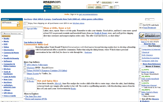
Circa January 2001:

Amazon2001

Note how text heavy the site was. Since most folks were still dialing up to the Internet, it was important to have only a few pictures. Even the navigation was text heavy and designed to get you to a category quickly. Notice also the prominent search box in the upper left hand corner – some things haven’t change and the value and importance of search was well understood even back then.

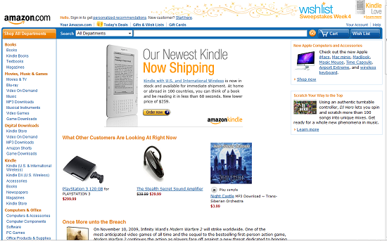
Circa January 2010:
Amazon2009

Now we’ve got a lot more and larger graphics in order to showcase the products. Now the search bar is considerably longer. In all likelihood in the 10 years ago site, I would have only typed in one or two words. Now I’m comfortable typing in the whole title of a book or model of an item that I’m looking for and can see the whole thing in the search bar.

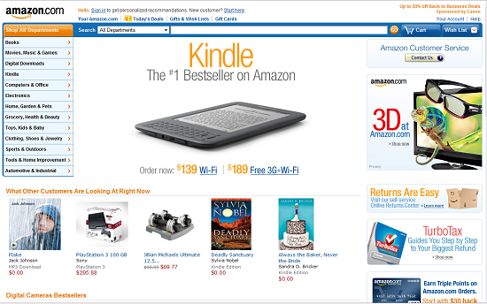
Amazon2011January 2011:

Looks pretty similar doesn’t it? Even the Kindle is prominently featured. Notice in both last year and this year how the immediacy of an experience things are. You can see what other customers are looking at RIGHT NOW. While there is more “stuff” in this year’s page, there is still a good use of white space to focus attention – that Kindle really stands out. Amazon has figured out though how to add more advertising on the right without overwhelming the page and they have tightened up the navigation on the left opting for pop-out menus instead of a longer listing of categories.

So what does this mean for you and your site?

First it means that if you haven’t changed your site in a few years, the time has come. It needs to be refreshed. Like your logo? Keep it. But consider what you want your site to do and then look at it and ask yourself if it is helping you do that? How can it be done better? Have you changed your services or products? Do you have something you should be featuring as prominently as Amazon features their Kindle?

Next it means you need to stay on top of (but not necessarily on the bleeding edge of) change. What is happening that will affect your business and your web site. When the automobile was first invented, how many blacksmith’s thought it was a passing fad? When the computer was invented how many typewriter makers thought it was just a flash in the pan? Don’t be left behind because you’re not staying on top of change.

It also means that some of the things you try might not work. Over the years Microsoft has had some spectacular failures (anyone remember Microsoft Bob?) but they continue to be a very powerful force because they try new things. Right now social media marketing is all the rage. Passing fancy? Who knows? The one thing I do know is that 100s of millions of users are out there so we’re engaging because that’s where our potential customers are.

If you want help changing your site, call EduCyber at 303 268-2245.

SHARE THIS:

Test Your Site across Browsers

When I worked in Tokyo (in the late 90’s) I remember looking at a web site affiliated with where I worked and it looked terrible. Worse than terrible. When I went to talk to the designer (this was not his job) I understood the problem even before we began to talk – he worked on a huge monitor (21 inch CRT) and the site looked great on his monitor and while using Internet Explorer.

The lesson I learned that day was the importance of testing a web site in a variety of browsers, resolutions and monitors.

There are more browsers out there than some realize. The main ones are Internet Explorer, Firefox, Chrome, Safari and Opera. When testing with Internet Explorer you get the joy of testing several different versions as well. The much despised Internet Explorer 6 has finally dropped in usage to the point where designers can design without all the goofy restraints that come with it.

So for Internet Explorer flavors, you should test with IE7 and IE8 and perhaps even the test version of IE9. Basically since the demise of IE6, you get a similar look no matter which version of IE you are using but it doesn’t hurt to check different ones to be sure.

With the other browsers, testing across different versions isn’t as important as making sure you at least take a look at the site with a current version of the browser. The vast majority of Firefox users are on version 3.6 so that would be a good one to test with (at least in January of 2011).

Chrome is an up and coming browser, primarily because it is a Google product. Between September of 2009 and September of 2010, Chrome nabbed about 8% of the browser market from Internet Explorer.

Safari and Opera account for 4.4% and 2.0% of browsers being used so it isn’t a bad idea to check in these browsers as well.

Except for multiple versions of IE, it is relatively easy to install and run these browsers, all within the same system – I’m writing this on a system with IE, Firefox, Chrome and Safari installed.

Other factors to check to make sure your web site displays correctly include testing it on different operating systems and testing it on handhelds. The biggest problem we’ve heard so far is about Apple’s decision not to support Flash. There goes your nice Flash presentation if you’re getting a lot of visitors using Apple’s iPad, iTouch or iPhone to view your site.

A little bit of testing can save you the embarrassment of having your site look like it was designed by a middle school student.

Need help making your site look right across browsers? Turn to EduCyber and we’ll help. Give us a call at (303) 268-2245.

SHARE THIS:

3 Reasons to Invest in your Web Presence in a Down Economy

What’s happening in your financial world? If you’re like most folks, you’re not sure whether we’re headed up or down or what is around the next corner.

In uncertain times it can be difficult to see a way forward and spending money is the last thing many business owners want to do. Yet here I am telling you to invest in your web site. What gives?

Here are THREE reasons you want to invest in your site now:

  1. Get better efficiency. There are several ways to accomplish this: Put more information on your web site so you spend less time answering the same questions over and over again; Qualify your customers better through your site so that those you contact are ready to do business; Reduce or eliminate your store front and sell more from the web site. These are just a few of the ways you can be more efficient with an investment in your site.
  2. While your competitors are giving up and going away, you can establish a firm or firmer foundation now on your web site without having to build a new building or sign an expensive new lease. Your site should look professional (good design), be functional (easy for customers to do what you want them to do) and be search-friendly (search engine optimization)
  3. Get more customers. Beat the rest of the crowd that is still stuck on search engine optimization – which means driving more traffic to your web site – and get started on conversion optimization – which means getting the folks who visit your web site to buy, register, signup, or whatever your call to action is. If you have any degree of traffic you should look at what those visitors are doing and if they aren’t contacting you to do business, optimize the process to make it smoother for them to do business with you.
SHARE THIS:

EduCyber Named Wheat Ridge Business of the Year

EduCyber, Inc. a Denver Web Design and Internet Marketing firm was named the 2010 Wheat Ridge Business of the Year. Following is the text of the Congressional Record presented by Ed Perlmutter, Member of Congress:

Madam Speaker, I rise today to recognize and applaud Brian and Maki DeLaet, owners of EduCyber Inc., for receiving the 2010 Wheat Ridge Business of the Year Award.

EduCyber Inc. began as a home based business in 1998 and has successfully grown under the leadership of Brian and Maki DeLaet. Its growth is attributed to the high level of personalized service provided to its clients and the business model used has become one that others seek to incorporate in their own businesses.

Brian and Maki DeLaet are active contributors to the business community. EduCyber is a member of The West Chamber of Commerce, Enterprise wheat Ridge, Wheat Ridge 2020 and the Applewood Business Association. In addition to their active participation in the community, they have lent their support to new city development projects such as new parks and new bike and walk-ways.

I extend my congratulations to Brian and Maki DeLaet, owners of EduCyber, on their recognition and thank them for their commitment to our community.

SHARE THIS:

We are proud members of many community organizations and chambers. See Our Community Involvement.

©1998-2024 EduCyber - All rights reserved. | 4251 Kipling Street, Suite 340 Wheat Ridge, CO 80033 USA | info@educyber.com