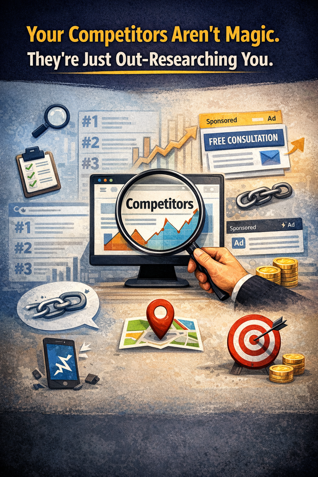
Let’s be honest: a lot of web “trends” are just rebranded distractions. By the time something shows up in a marketing PDF or a LinkedIn post, the teams doing real work have already moved on.
If you’re launching a website in 2026, your biggest competition isn’t design. It’s attention span. You’re not just trying to impress—you’re trying to earn someone’s focus for more than three seconds.
The era of “wow” is over. Giant visuals, auto-play anything, complex interactions—they’ve pretty much finished. What’s replacing them? It’s not flashy. But it works.
It's utility. Clarity. And respect for the user's time
This isn’t just a trends list. It’s a snapshot of what’s still standing after being tested by real users, real expectations, and real budgets.
Smart AI, Seamlessly Integrated
We’re moving past the gimmicks—chatbots popping up uninvited, “Powered by AI” labels slapped everywhere.
Now, the best AI is nearly invisible. It watches for patterns—repeat visits, pauses, hesitation—and adapts subtly. Maybe a layout shifts. Maybe the CTA changes. But it never waves for attention. It just works.
If someone notices the AI, it’s probably trying too hard.
Accessibility Is Non-Negotiable
Accessibility isn’t a checkbox anymore—it’s table stakes. It’s not just ethical. It’s smart business.
Today, unreadable contrast, unlabeled form fields, and inaccessible navigation aren’t rare mistakes—they’re dealbreakers. They damage your brand, your user experience, and potentially expose you legally.
Good accessibility doesn’t call attention to itself. It just feels like the site was built by people who know what they’re doing. Kind of like our sites…
Designing for Thumbs, Not Desktops
Mobile-first isn’t a slogan—it’s reality. Most users are interacting one-handed, on the go, using just their thumbs. Yesterday I was annoyed when the app I was on required me to use both hands to get the right button.
Navigation needs to reflect that. Calls to action need to be reachable. And long blocks of text? They have to earn their place. If your key buttons are still top-left, you’re losing people silently.
Micro-Interactions That Build Trust
Not everything needs to move. But some things should.
A button should react. A loading bar should behave like it knows what’s happening. Tiny touches reduce uncertainty—and uncertainty kills conversions.
You don’t need to delight every user. But you do need to reassure them that they’re in the right place for the right reasons.
Modular Layouts for Growing Content
The “bento box” layout is still winning because it works. As content grows, modular layouts adapt.
Flexible, clearly organized sections let users browse, scan, or deep dive—on their terms. This isn’t just minimalism. It’s making it easy for people to find what they need without wading through noise.
Modular Layouts for Growing Content
There was a time when scroll effects felt more like a hostage situation than a user experience. Fortunately, that phase is over.
In 2026, scroll is a tool for discovery—not performance. It adds context, helps users explore, and supports storytelling—without taking away control. The best scroll effects today feel more like responsiveness than animation.
Performance Is a Brand Decision
Letting the Words Lead
Page speed isn’t just a tech detail—it’s part of your brand. Every bloated image, every script you don’t need, slows things down—and people notice (and so do search engines!).
Fast sites don’t just rank better. They feel better. In 2026, performance is part of your design language. Speed says: “We value your time.”
You don’t need video everywhere. Sometimes, motion applied to copy—smart, purposeful typography—says more.
Kinetic text helps users navigate. It sets pace. It tells a story. And unlike big-budget visuals, it tends to age gracefully. Smart businesses are learning to let language carry more of the visual weight.
Search is Now a Conversation
People don’t search like robots anymore.
With voice and AI assistants, queries are longer and more natural. Sites that win are the ones that answer—clearly, plainly, and with purpose. If your content reads awkwardly out loud, it’s probably missing the mark.
Personalization That Feels Right
Users are wary of being tracked in the background. And they should be.
The better approach? Let them tell you what they want. Let them choose their preferences. When personalization feels like a service, it builds trust. When it feels like surveillance, people opt out.
One Final Thought: Focus Wins

You don’t need to implement everything here. In fact, trying to do so is usually where projects go wrong.
Instead: find the two areas where your users are struggling most. Fix those—really fix them. Then move on to the next thing.
In 2026, the best websites aren’t the most impressive ones. They’re the ones that quietly remove obstacles… and get out of the user’s way.
Need help with any of these—or all of them?